How To Style Accessories to Transform Any Outfit
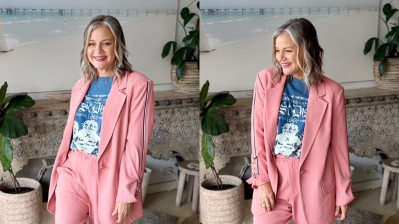
A simple thing like changing out your shoes and your handbag can, in fact, swing your outfit into a whole new direction.

Apricot (my suit) loves royal blue (my tee shirt), it also loves black and white print which helps me know that it also sings against higher contrast prints llike my tee.

Colour theory is everything for an impactful outfit but then we can elevate it further by bringing in the friction.


In the above outfit, I softened the edgy masculine boots by adding the feminine, more curvy handbag. The friction here is tough vs soft.

In the below outfit, the friction is beach vibe relaxed day sandals vs going out more nighttime clutch bag. 


Then, with my suit having side stripes on both the jacket and pants, I am able to bring in a 3 level print clash with tee, suit, and gazelles.

Due to the playful "She's definitely not going to work" vibe, I chose my Director's bag to create the friction of "Hang on, maybe she is off to her Ceo office". 


Begin with "colour theor...

Continue Reading...

How to Wear Espresso Brown Colours That Make It Work for You

 

There’s a new colour creeping into wardrobes that I think is going to be very hard to ignore… Espresso. 


But here’s the thing I want you to know about trends like this: you don’t need to wear a trend just because it’s trending.


The question I always ask is: “Does this colour work for YOU?”


Because the right colour can make your skin look brighter, your eyes clearer, and your whole wardrobe feel effortless.

The wrong colour can do the exact opposite.


So, what exactly is espresso?

Think of a really good shot of coffee; it's a very deep and rich dark brown and can be an almost-black depth, inspired by roasted coffee beans.


And if you’ve been wearing black for years, this is a beautiful way to swap it out for dark taupe so you suddenly feel like you’re wearing “colour”.

And this is where knowing your skin colour and your own colours becomes incredibly important.

One of my favourite ways for each colour type to wear espresso (or dark taupe):


Hair colour type: Dark taupe with ...

Continue Reading...

How to Mix Prints: The 3-Step Formula for Print Clashing
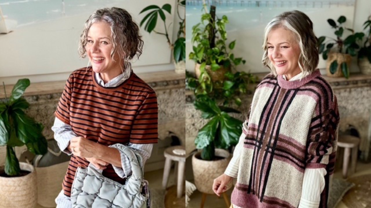
...

The 3-Tier Formula for Print Clashing


The formula for print clashing has three tiers, and the first is by far the easiest place to start.
 

Tier One: Find the Common Thread
 

The simplest way to mix two prints is to choose prints that share the same print formation, for example, stripes with stripes.


The secret is scale.
 

Make one print large in scale, and the other medium or small. This creates enough difference between the two prints for them to work together, rather than compete for attention.
 

Think: same language, different volume.
 

That’s what makes the clash feel intentional rather than chaotic.


Tier 2: Find the Colour Connection
 

The second tier is a little more adventurous.


Here, the prints have one or two colours in common, but the actual print formations are completely different. They are in friction with each other.

Think stripes with florals, sharp angles with soft curves, or checks with organic shapes.


Tier 3: Let Colour Theory Do the Work
 

Continue Reading...

The Secret to Mixing Fashion Trends Without Looking Overdone
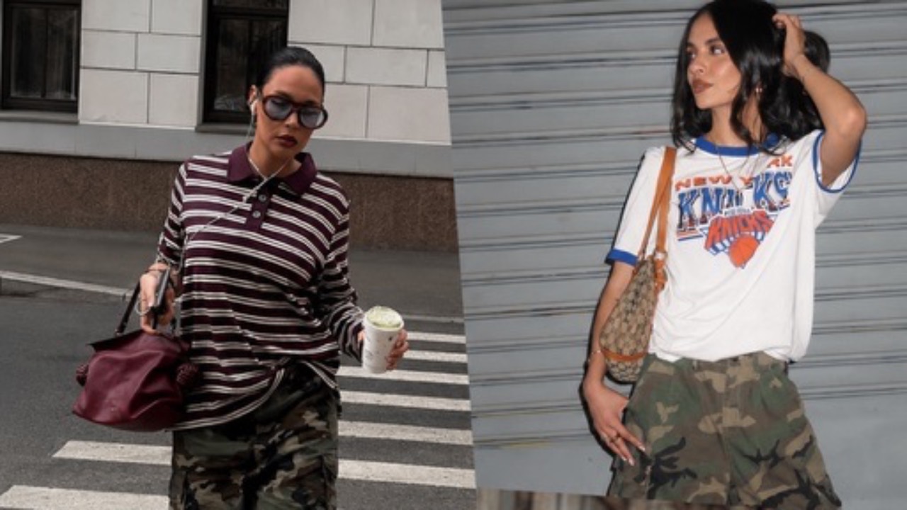
 

As we get ready to break out our toes, it's time to warm up and practise your Boss Friction Formula.
 

Let's take a look at the stylish friction happening in the outfits below.
 

You'll see camo Bermuda shorts (those knee-length shorts that finish around the knee) paired with striped polo tops, and camo shorts and pants teamed with graphic tees.


At first glance, these pieces might seem like they're competing with each other but look closely at what's been added to create that beautiful balance between masculine and feminine...
 

  • Necklaces
  • Earrings
  • Handbags
     

These little feminine details completely change the conversation.
 

Then we have blazers with denim Bermuda shorts (or jorts, as they're now being called), heeled thongs, oversized sunnies (red is a huge trend right now!) and cute handbags.
 

Here's the thing... Nothing matches.
 

And that's exactly why it works.
 

There are contrasts everywhere.
 

Relaxed with polished. Masculine with feminine. Stru...

Continue Reading...

How to Dress Up Jeans: The Secret to Making Denim Feel Feminine
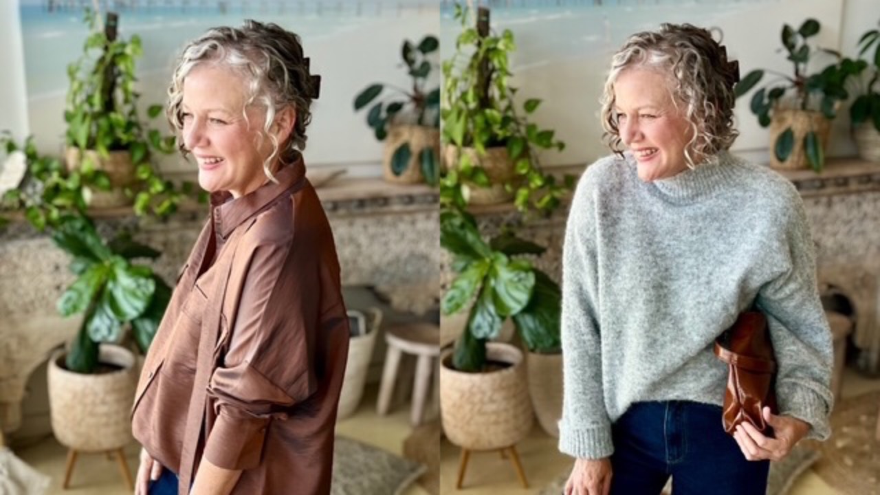
 

Why Jeans LOVE Pretty Things
 

I want you to stop thinking of your jeans as casual clothes.


Because jeans can be so much more than that.


One of my favourite ways to make denim feel fresh, feminine and interesting is to pair it with something pretty.


Think the colour pink, soft fabrics, beautiful prints, a delicate blouse, a feminine shoe, a gorgeous necklace, a top with a little bit of sparkle or sequins, something floaty, romantic, or suited to a fancy dinner.


Why does it work so beautifully?


Because Contrast creates interest, and Friction equals Style.


The relaxed, uncomplicated nature of denim gives you the perfect foundation for something softer or more refined.


The jeans stop the pretty piece from feeling too precious and the pretty piece stops the jeans from feeling too casual.


It's that delicious little push and pull between casual and sophisticatedthat makes the outfit feel modern.


Don't be afraid to mix your worlds.


You could wear your favourite jean
...

Continue Reading...

What Colours Go With Light Grey? The Easy Styling Formula
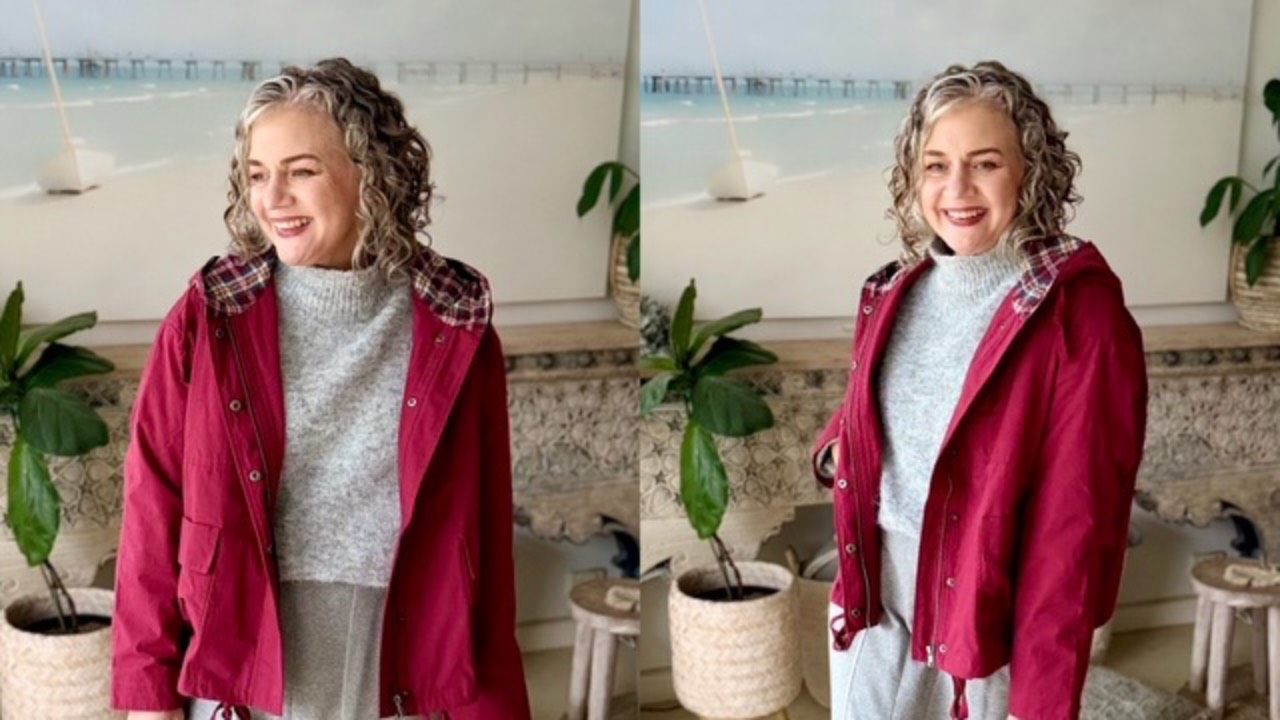
 

When you wear light grey, think of it as a beautiful supporting neutral.


Because it’s so soft and understated, whatever you wear with it becomes the feature. At the same time, light grey has a clever way of softening the impact of really bright colours, so they feel a little more wearable.


From there, you can decide how much contrast you want to create.


Keep your shoes medium dark, for a more subtle contrast, or go much darker to create a stronger, more dramatic effect.


The key is to keep enough contrast between your last hemline and your boots and that can be done so easily with light grey as not too much won't create a contrast.

The choice simply depends on the look and level of impact you want that day.


Even white boots are a winner with light grey as bright white contrasts everything! 


en white boots are a winner with light grey as bright white contrasts everything! 

Nat xo

 

Want to learn what colours go with strawberry?

 
...
Continue Reading...

How to Style Necklaces: Find the Right Length for You


Now, let’s dive into Necklace Know-How 
 

Finding a top where the neckline is both the perfect shape for your face shape and lands at your ideal face length (like the white V-neck in the first photo) is rare, but when you do, it’s a dream come true. 

In these cases, you don’t need to do anything to balance or correct the neckline.


You’re free to accessorise still with a ribcage-length necklace or earrings but just remember earrings should not fall longer than your face length (no lower than your chin).


Now, if your top has a neckline that sits higher toward your chin (second photo), it can create a visual disconnect between your head and body. To fix this, you’ll need to “cut out” the neckline, think of it like cutting a slice of pie from your top.

This is where necklaces come in. The necklace doesn’t have to be a bold statement piece (though, Vibrant colour types, you can go all out as that’s your style).

Even a subtle piece can make a huge difference in b
...

Continue Reading...

When Does A Print Act Like Mascara


Hold up, what does Nat mean when she talks about something being mascara (a slight visual highlight) rather than being a full dominant print that shouldn't be matched, only enhanced by a colour or used as a fabulous print clash?
 

Let's begin looking at the example below. These ivory pants have a double black line (dominant) and a middle white stripe (mascara).

How can you tell the difference? 

The black T-shirt looks as though you are trying to match the dominant stripe with your tee = old-fashioned. 

And it falls flat.

Whereas the white T-shirt looks fresh and appears to be non-repeating to the white mascara middle stripe, like you aren't trying to match = so stylish.

The outfit feels fresher, lighter, and much more modern.


Then there are the no-shadow-of-a-doubt strong print items that want a direct print clash in black-and-white print as well, but at a different scale.

The first image below has the jacket and pants in a small scale print with the long sleev
...

Continue Reading...
Close

50% Complete

Two Step

Lorem ipsum dolor sit amet, consectetur adipiscing elit, sed do eiusmod tempor incididunt ut labore et dolore magna aliqua.