Why Jeans LOVE Pretty Things
I want you to stop thinking of your jeans as casual clothes.
Because jeans can be so much more than that.
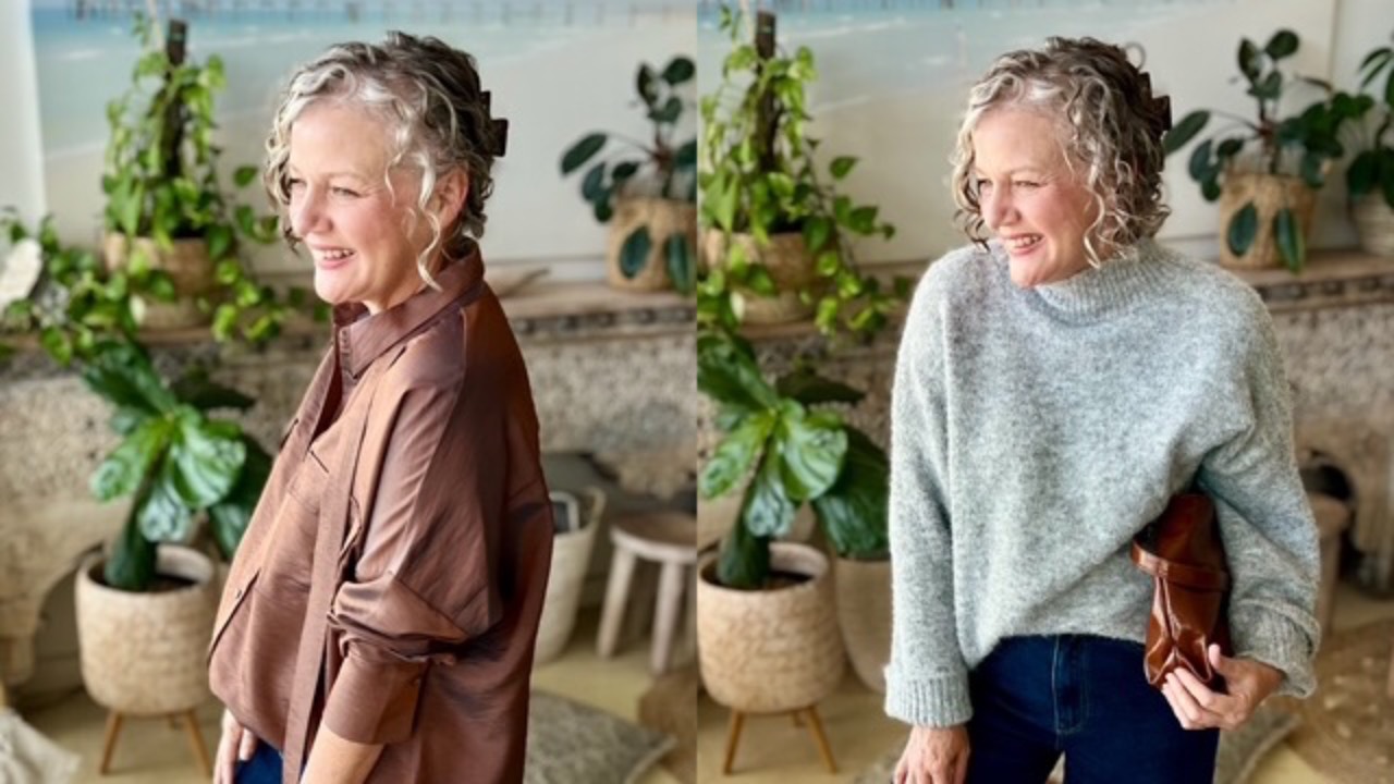
One of my favourite ways to make denim feel fresh, feminine and interesting is to pair it with something pretty.
Think the colour pink, soft fabrics, beautiful prints, a delicate blouse, a feminine shoe, a gorgeous necklace, a top with a little bit of sparkle or sequins, something floaty, romantic, or suited to a fancy dinner.
Why does it work so beautifully?
Because Contrast creates interest, and Friction equals Style.
The relaxed, uncomplicated nature of denim gives you the perfect foundation for something softer or more refined.
The jeans stop the pretty piece from feeling too precious and the pretty piece stops the jeans from feeling too casual.
It's that delicious little push and pull between casual and sophisticatedthat makes the outfit feel modern.
Don't be afraid to mix your worlds.

You could wear your favourite jean...
|